| Provider | WÖHR Autoparksysteme GmbH |
| Purpose | Essential cookies enable basic functions and are necessary for the proper functioning of the website. |
| Privacy Statement | https://woehr.de/de/datenschutz.html |
| Names | PHPSESSID, csrf_contao_csrf_token, csrf_https-contao_csrf_token |
| Lifetime | When ending the browser session. |
UP! Berlin / Berlin, Germany / Combilift 551
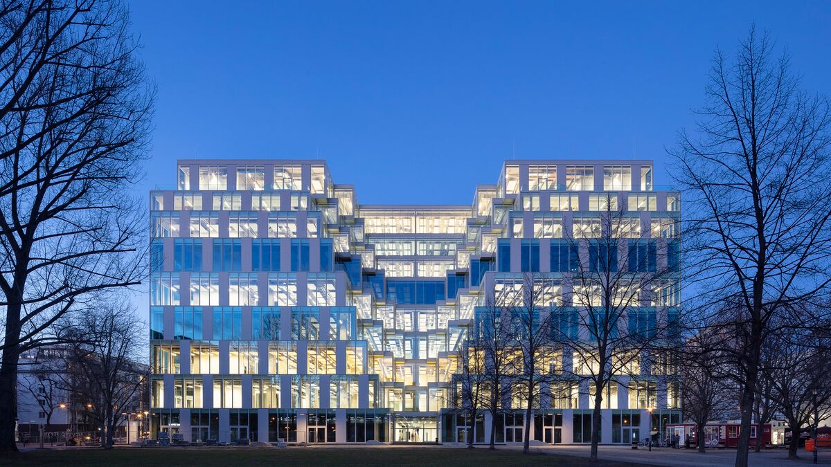
In the Friedrichshain district of Berlin, not far from the Mediaspree, an up-to-date office building is ready for use, and has now been occupied by the first leaseholders, the online fashion retailer Zalando and the payment service provider SumUp. The news seems less than earthshattering, considering the number of office buildings that have been erected in recent years between Warschauer Brücke and Ostbahnhof, in particular by Zalando. But this fresh face, located behind Ostbahnhof, is not a new structure; instead, a dilapidated existing building has been painstakingly infused with new life.
The point of departure for this successful revitalization project was the Centrum Warenhaus, regarded as highly modern when inaugurated in 1979, which sat in the shadow of Berlin’s third-largest train station in an urban environment dominated by prefab buildings. Despite its colonnade with display windows, the square, six-story solitaire, each side measuring 80 m in length, was self-contained in a way typical of department stores. By 2016, reunification, continual changes in ownership, and the protracted decline of downtown department store culture had brought it to an end.
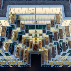
The provisional finale of this revitalization endeavor is a highly modern, transparent office building with four deep incisions in the building’s outer shell and 78 terraces with varied dimensions.
In the evenings, the now nine-story building – which has been renamed UP! Berlin – is a positively radiant presence within this heterogeneous urban district. Enthroned above is a gigantic roof terrace – accessible, unfortunately, only to employees.
Integrated in the urban space
It was Martin Jasper’s estimable achievement to have refashioned this building – despite its sheer size – in a way that integrates it quite effectively into the surrounding urban space. The design model by the architect, a native of Buenos Aires, already displays the intended approach: rather than creating an interior courtyard, Jasper sliced open the cube on all four sides to differing depths, allowing light to enter into the strikingly tall regular stories (each measuring 5.4 meters) of the deep building. He gave these incisions – he calls them “voids” or “canyons” – staggered terraces which serve to enliven the facade. Two new stories, stacked on top of the existing structure, compensate for the surface area that was sacrificed as a result.
Ultimately, in response to a desire expressed by SIGNA, the client, Jasper implemented the design in collaboration with the runner-up architectural office of Gewers Pudewill, based in Berlin, which also took charge of general planning.
It sounds simple enough: excise certain sections, stack new stories on top, give the whole a transparent facade. Easier said than done! Challenging in particular was the need to ensure stability during demolition work, a task fulfilled by the structural engineers of Bollinger and Grohmann with the help, among other things, of adhesive reinforcements. A new, centrally configured fifth circulation core yielded improved access to the various stories. Diagonal exposed concrete supports along the voids ensured the stability of the final result, tracing out the prevailing forces for all to see and enlivening the appearance of the extremely wide support grid, which measures 12 by 12 meters. The grid endows the building with an industrial look, emphasized as well by the roughness of the skeleton and the historical traces inscribed onto it.
Lively facade
The color scheme, developed by Zalando, distributes 15 different tones per story on the floors and kitchenettes. Smaller installations in and around the four old circulation cores preserve a sense of spaciousness while being integrated harmoniously into the larger whole. Found here are the conference rooms.
Altogether 500 ceiling panels per story ensure good acoustics while concealing the necessary building services.
Toward the outside, the highly artificial element facade encloses the building with room-height windows. Compared to conventional new office buildings, the dimensions of the windowpanes are larger, a factor that had to be taken into consideration during planning from the very beginning. The regular alternation between transparent and opaque elements with narrow ventilation flaps generates a lively facade image, enlivened further by the visible support framework and views of people working inside.
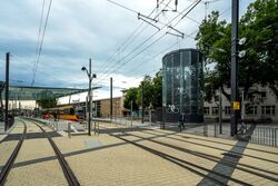
On sunny days, the facade reflects all of the colors of the spectrum; confronted with the grayness of November days and the drabness of the surroundings, consisting of parking wastelands and indifferently configured green spaces, temporary market stalls, and deserted takeout food joints, color is however conspicuous in its absence. In this part of Berlin, just the same, the glazed figure of UP! Berlin provides a kind of optical haven. Once all of the shops in the ground floor have been leased, it may indeed do justice to its intended role as a local shopping option. The tall shops, which face all sides, await gastronomy and retailers.
Project specifications
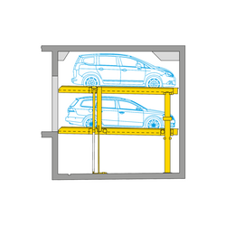
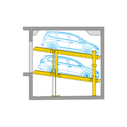
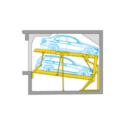
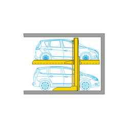
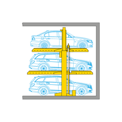
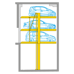
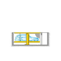
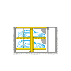
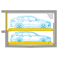
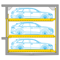
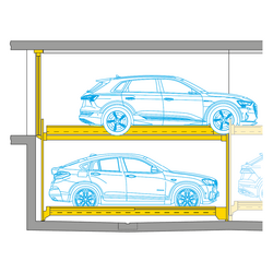
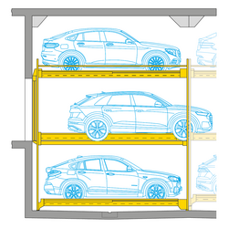
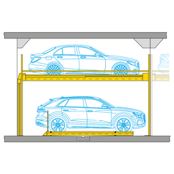
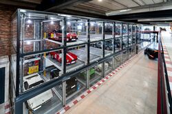
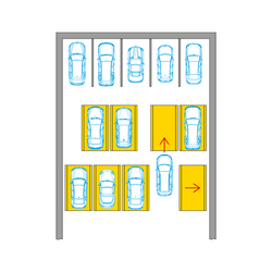
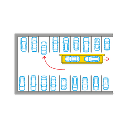
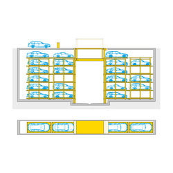
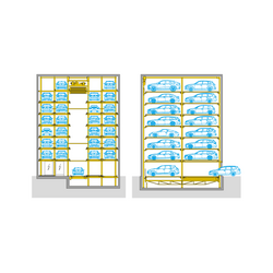
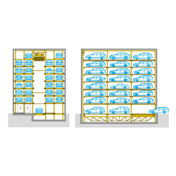
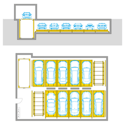
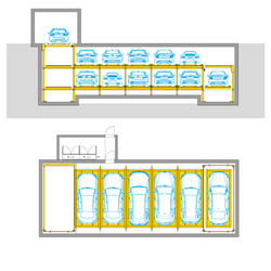
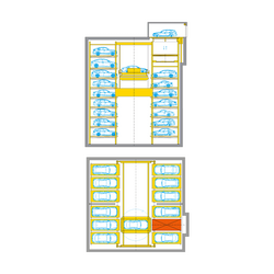
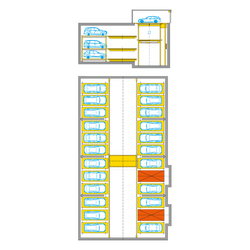
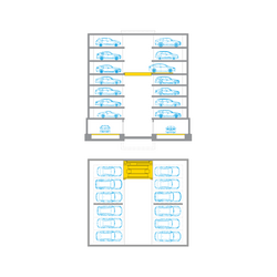
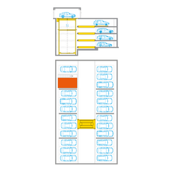
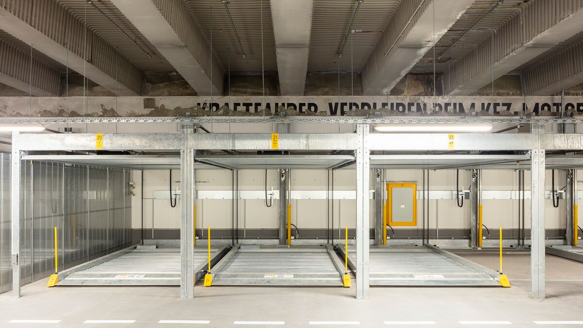
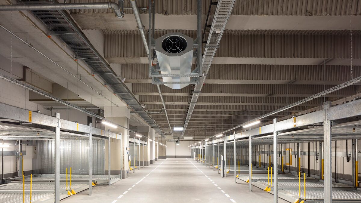
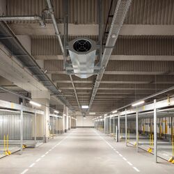
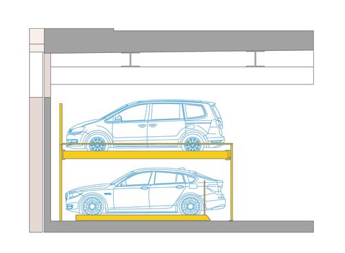
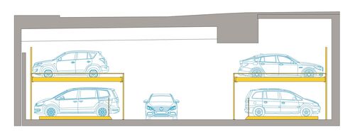
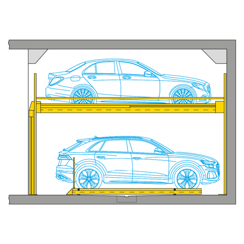
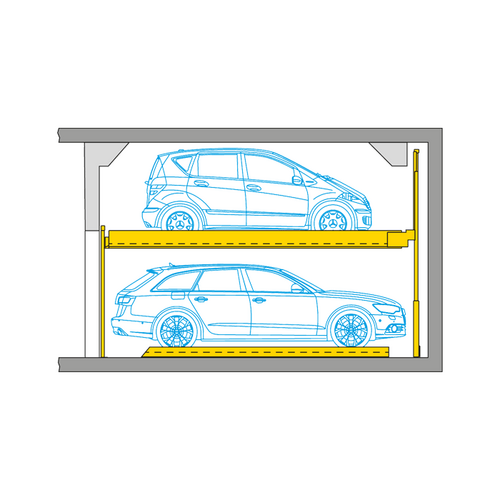
- WÖHR Combilift 551
- 83 parking spaces
- Platform load max. 2,000 kg
- Vehicle heights max. 1.75 m resp. 2.00 m
- Platform widths ground floor 2.27 m
- Platform width upper floor 2.50 m
- Operable via Smart Parking App and radio remote control
- Smart Profile 2.0 and Alu Prime Profile
